 Pretty much everything you use was designed by someone, very likely an engineer. Well, that doesn't include entirely natural things like plants and animals, although even some of them have been designed these days (it's called genetic engineering). Did you ever think about that? Products you buy are the way they are because someone designed them that way. Of course, a designer can't do just anything. He or she is limited by the laws of physics, the properties of materials, and economic constraints. As an example of the latter, you can do a lot of nice things with gold as a material, but you can't afford to put very much of it in your product. Designs usually get better over time - designers learn from all the designs that have gone before them, and they think of improved ways of doing things. New materials and new techniques become available. In my entry Copies, in footnote 5, I pointed out that these days, home copiers costing less than $100 feed paper easily 10 times more reliably than the $100,000 copiers I used in the sixties and seventies. Someone figured out a better way to do it.
You can click on the picture to enlarge it, and return here with your "Back" button. You can do that with all the pictures in this entry.
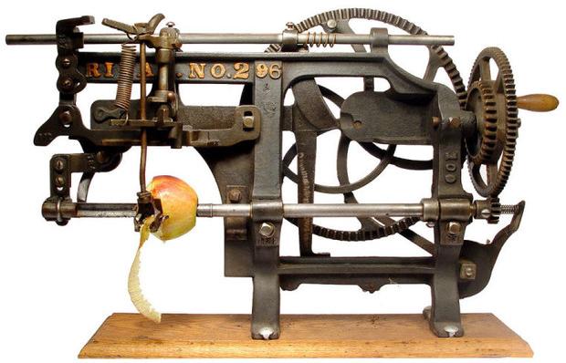
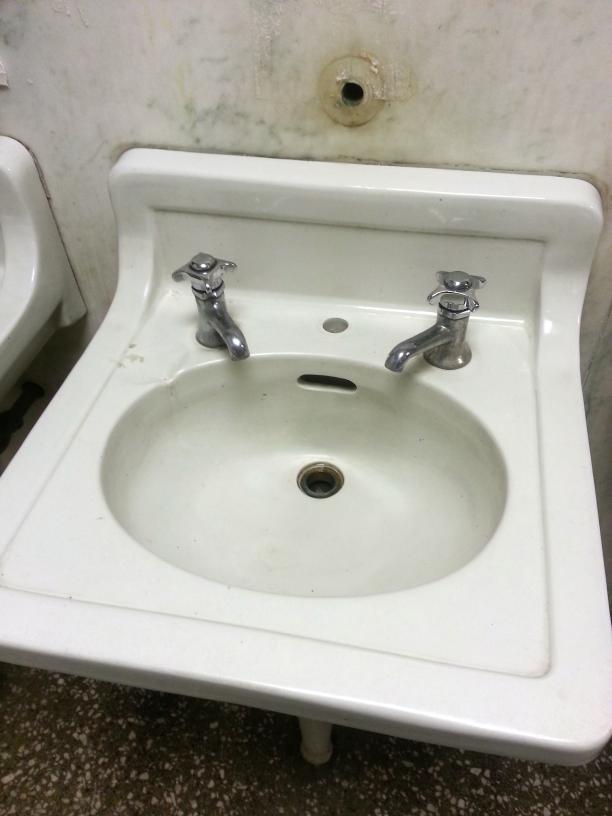
Over the next few decades, they got simpler and simpler, as shown by the example to the right. The same shaft that rotates the Apple is also used as a screw to advance it past the cutter and corer-slicer blades. But every now and then, I come across a design that is so egregiously bad that I almost can't believe it. I can't believe that a designer would have deliberately designed it that way, and I can't believe that a customer would ever have purchased the product. I'll mention a couple I came across recently, which I photographed with my cell phone. They are both sinks with hot and cold water taps, found in public restrooms.
Bad design number two: the water runs only as long as the faucet knob is rotated and held. If the knob is released, it springs back to the off position. This means that you need to hold the knob with your right hand while you wash your left-hand, and hold the knob with your left hand while you wash your right hand. You can't hold both your soapy hands under a spout and rub them together to rinse them, which is what people usually want to do. In other words, this faucet design does an extremely bad job at the sole task for which it was designed: helping you wash your hands. I have no idea if these are the original sinks installed when the building was constructed in 1916, but I can't help thinking that this would have been bad design even back then. The purpose of the faucet valve being only "momentary" (the water runs only as long as the knob is turned and held) is obvious: the designer doesn't want the user to be able to turn on the water and then go away and leave it running. A better solution to that problem was used in the next sink, discussed below.
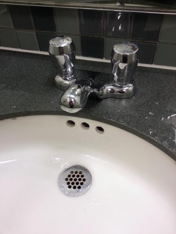
In this design, a better way has been found of making sure the user shuts off the water when he's done. The user presses on the top of the valve, starting the flow of water (either hot on the left, or cold on the right). The water then runs for a few seconds before automatically shutting itself off, using some sort of mechanism operating off the water's pressure and flow. And this time, the designer has run the hot and cold water into a single spout, so they mix to produce warm water that's an appropriate temperature for hand washing. This solves the problem of the earlier sink of having the water at two different temperatures come out of separate spouts. But in conjunction with the timer valves, there's still a problem. The amount of time each valve allows the water to run is poorly controlled, and the valves are not apt to both shut off after the same amount of time. Even if you press both valves at approximately the same time, and then put your hands under the tap for rinsing, one of the valves is apt to shut off before the other. If the hot water valve shuts off first, you will suddenly find yourself washing your hands in cold water. This is unpleasant, but is not a serious problem. On the other hand, if the cold water valve shuts off first, you're suddenly washing your hands in pure hot. Depending on the water temperature, you might find yourself getting scalded. A much better solution would be to mix the hot and cold into warm water before the valve, and then turn the warm water on with a single timer valve. I've seen this solution used. Not only is this a more acceptable solution, it reduces the number of timer valves from two to one, and I imagine those valves are the most expensive component in the system. Why would anyone design a sink with two of them instead of one, especially since the design with only one is a better design? There are actually two other problems with this sink. Although it's hard to see in the photo, the faucet is too short, so the water emerges only a few centimeters in front of the back of the basin. When trying to rinse directly under the tap, your hands touch the back side of the (possibly contaminated) basin. The spout needs to be longer. Assuming the designer actually tried using his own product, shouldn't this flaw have been completely obvious? One final problem: when you press both valves, the water flows out much too fast. It's not easy to see in the photograph, but I found water splashed all over the top of the sink, making the area rather messy. It's impossible not to splash, because the stream of water is just too powerful. Perhaps there's an adjustment somewhere underneath the sink that can be made by maintenance personnel. It strikes me that this design is particularly problematic in a hospital. Users need to depress the valves with their dirty hands, and are likely to have their hands contact the basin. The difficulties rinsing your hands, and the messy splashing, may discourage some people from washing at all. A hospital really ought to have a more modern faucet, turned on electronically by a proximity detector. Note 1
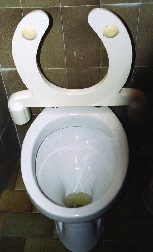
Margie explained that she had been intrigued by some of the toilet designs she had seen in women's rooms in Italy, and she'd taken pictures of them. Since all these photos were taken inside women's restrooms, I had been entirely unaware of this activity. You can see an interesting one to the left. It uses counterweights to lift the seat if nobody is sitting on it. The right side of the photo is shadowed, but the seat unit is symmetrical - it has the same counterweight on the right side as the one you can see clearly on the left, sticking out and down from the raised seat. When the seat is down, the counterweights, on the opposite side of the hinge, are raised up. There's no doubt a heavy weight inside them, probably a hunk of lead. This makes them heavier than the seat itself. Thus, if nobody is pressing down on the seat, the counterweights in the back drop, lifting the seat in front. Note 2 By using counterweights instead of springs, there are no working metal parts that would need to survive the somewhat corrosive restroom environment. Since the weights can be molded into the same plastic used to mold the seat itself, the entire unit is smooth and can be easily washed down. I don't know why I've never seen such a thing in the United States. It probably could have saved a few marriages. Seen any other bad designs? Let me know, and maybe I'll write a blog entry on them.
  Note 1: Here's an amusing story about a sink. I can't give you the name of the author, because I read it many years ago. I think it might have been in the Reader's Digest. An American visiting Montréal, Canada washed his hands in a restaurant restroom. He then complained to the manager because he had burned his hand under what he had taken to be the cold water faucet, which had the letter "C" on it. The manager pointed out that Montréal is in the French-speaking province of Québec, and the "C" stood for "Chaude", the French word for "hot". The restaurant patron felt properly chastened, until he suddenly noticed that the other faucet also had a "C" on it. To that, the restaurant manager said, "That 'C' stands for 'Cold'. This is a bilingual restaurant, my friend." [return to text] Note 2:
Actually, the weights have to be quite a bit heavier than the seat, because they don't stick back as far as the seat sticks forward. Being closer to the hinge, they don't have very much leverage. If you weren't very good at physics in high school, you'll just have to trust me on this. [return to text]
 |


